|
|
Post by Antiscamp on May 6, 2013 15:44:32 GMT -5
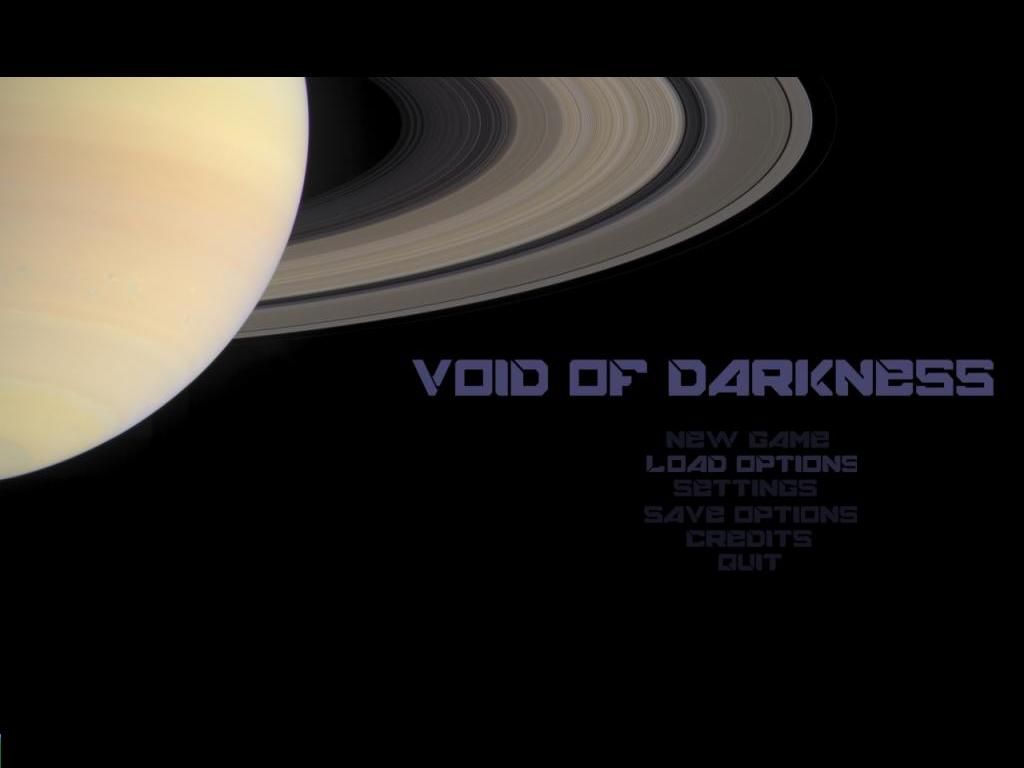
I have a suggestion for the title screen. Something like this. I did this quite quickly and it looks pretty clean. 
My idea is that the text items in the menu light up as you move your mouse over them. The inspiration for something like this should be obvious   |
|
|
|
Post by Justin on May 6, 2013 17:55:43 GMT -5
that's pretty darn good! I like it!
Thanks so much. I wonder, just a thought could you shade the text in blue let me see how it looks? (sadly I am not an artist at all) that's why its even bad me trying to do the art for VOD and the sound. But at least I have been able to license alot of the sounds I use under creative commons!
|
|
|
|
Post by Antiscamp on May 7, 2013 0:32:27 GMT -5
Blue might be an even better idea, especially since a lot of your GUI is blue. I'll do that when I get home from work tonight and post it here.  If you want to use it, I can supply you with the full resolution picture with the menu either as is or removed. I don't know how you do the menu items, but if you indeed want to do the "lighting up of text" as I suggest, you might want to have two different buttons for each menu item, one light and one dark version? The Saturn image in the background is a NASA image and doesn't suffer from copyright. The font I use is Freeware. |
|
|
|
Post by Antiscamp on May 7, 2013 0:45:23 GMT -5
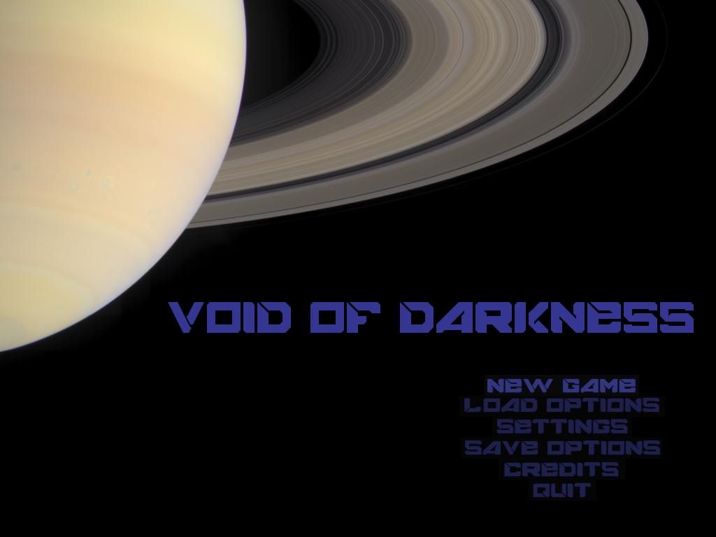
 Here we are. I did it before work during morning coffee.  |
|
|
|
Post by Justin on May 7, 2013 5:15:34 GMT -5
nice! Thanks. I'll handle the lighting. You can probably do a 1024*768 and a 1920&1200
I am catering for max 1920*1200. I will insert them today and post a shot!
|
|
|
|
Post by Antiscamp on May 7, 2013 7:59:48 GMT -5
|
|
|
|
Post by Justin on May 7, 2013 8:09:56 GMT -5
ha didn't see your new post. I dimmed load options in gimp. hope i got it to match the others.
|
|
|
|
Post by Justin on May 7, 2013 8:11:45 GMT -5
I don't know, the blue more pronounced blue throws it off from the hue of the planet, unless you make the planet darker, not blue but darkish blackish bluish mix up, otherwise the purplish haze of the second ones you did goes better with the backdrop if you can't change it.  |
|
|
|
Post by Justin on May 7, 2013 8:40:40 GMT -5
Here's a shot in game. Yep my mouse is on load options, to brighten it for the screen shot, to in essence show you the actual recreation of your concept   |
|
|
|
Post by Antiscamp on May 7, 2013 9:53:01 GMT -5
You are right about the blue being too dominant. I was tired when I got back home from work and my eyes were playing tricks. LOL. But I think the image would benefit from just a slight boost to the blue anyway. The first one is too greyish. Here's another version. Tell me what you think... It looks friggin' great in-game, btw. The title screen gives the first impression, and the one we've created here now is stylish, although simple. Would be great with a theme song too.    |
|
|
|
Post by Justin on May 7, 2013 10:52:43 GMT -5
i think perfect. Will use the latest ones.
|
|
|
|
Post by Antiscamp on May 7, 2013 11:28:00 GMT -5
Excellent!  |
|
|
|
Post by Justin on May 7, 2013 11:32:11 GMT -5
Here it is again. I might move the buttons to the left, to accomodate their functions lol. like the load options and settings, opens a window.  |
|
|
|
Post by Antiscamp on May 7, 2013 12:10:13 GMT -5
That does look smashing! I like it how the menu shines up with the same brightness as the big logo. Simple and good-looking.  |
|
|
|
Post by Justin on May 7, 2013 12:47:00 GMT -5
you rescued the world from my art. Never was artistic! They owe you a great deal.
|
|
|
|
Post by Antiscamp on May 7, 2013 13:37:18 GMT -5
LOL I did it quite easily and it was fun. It's a real honour to see it in-game too! Tell me if you need anything else, I'm no great artist either, but I can possibly do things like icons, buttons and stuff too. Otherwise I might keep a lookout for resources. You could keep a wishlist for resources on this forum too. Like music, sounds and art and people could help out wherever they have suggestions. Oh, and here's a link to that font. It's freeware. If you want to use it to keep texts otherwise in the game in-line with the title screen for standardization. It should be suitable for buttons and headlines, at least. |
|
|
|
Post by Justin on May 7, 2013 14:10:43 GMT -5
ooo a wishlist...want to take a look at the interface skin? I skinned it. It's like little boxes of color..so mall, you gotta magnify them like 800% to work in them. That's how I got all the blue in the interface. Skinned it blue and blackish.
I'll see about using the font in stuff.
So icons...right now the commands menu is written in words on buttons. What does your creative thinking do for these:
Engineering (opens engineering screen)
ViewScreen (opens viewscreen during alien encounters)
tactical (opens a tactical view)
raise shield (raises shields, no really it does)
arm weapons (...)
Scan (opens a window which holds info about stuff your scanning)
crew (opens crew management interface)
Dock ('docks' your ship.)
I think thus far I am covered for sounds under the creative commons, just need button click, or interface interaction sounds, but if anyone has a sound they want me to hear which might make a good sound for XXX, then they can post it.
I'll do up a post and sticky it. For now the other interface windows will change in beta, so I won't touch them yet, they can remain this way during the alpha.
|
|
|
|
Post by Antiscamp on May 10, 2013 3:15:23 GMT -5
I'll take a look at the buttons when I've seen the alpha and how they work in-game. My initial idea is to still have text on them, but also include a coloured icon of some sort at the left of them to really distinguish them from each other.
|
|